January 16th, 2008
Calling Photoshoppers – The Results
]]> 
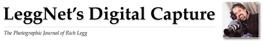
Last week I put out a call for Photoshop users who would like to put their skills to work on one of my images (original post). I received a very nice response and selected the first five to participate.
I have since received the four edited images (one person was unable to complete the assignment). In addition to doing a great job applying their Photoshop chops to the image, they each wrote a narrative on what they did and why they did it. It is very interesting for me to see the different style and approach each artist took.
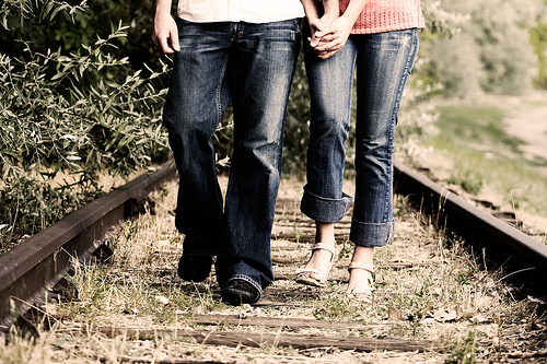
Each person was provided with an unedited JPG and RAW image (shown above) of the couple walking on abandoned railroad tracks. The only guideline given was that they could do whatever they wanted. Here are their results in no particular order.
Technically
In short – two Adobe Camera Raw interpretations of the same image,
over and under exposed. The diffusion is simulated by copying the
over-exposed image, blurring it, and using the Screen mode.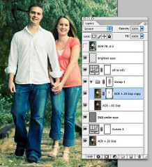
The under-exposed ACR conversion is blended with Multipy at a partial
opacity to bring back the dark zones. A Curves Adjustment Layer
introduces the Cross Processing look; search on-line for many cross
processing curve examples to download. One more thought: edit in 16-
bit mode when making dramatic shifts and expect a spiky histogram.
Down-sampling to 8-bit will smooth much of the spikiness out.
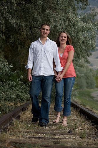
Cropped to 8×10, light sharpening for Rich to resize and sharpen for
printing.
Artistically
I imagined this couple would like one image from their engagement
session styled for fashion. I wanted to give them an image that they
will like now, their kids will laugh at on their 25th wedding
anniversary, and treasure on their 50th.
I liked the pose, motion and expressions, and how the color of her
shirt pops out of the image. But their beautiful skin and hair tones
get lost in the muddy colors of the tree leaves. And the unfocused
weeds at the bottom of the image have to go (Rich was smart to keep
the camera plane parallel to the couple, and allow some room in the
composition for cropping.)
Cross-processing refers to an old-school color film technque of
processing slide film as if it were color negative or vice versa. It
gives a characteristic color shift and contrast transformation to the
film, and has been used a lot in fashion photography. Another tool
fashion photographers might use is a diffusion filter. Since Rich
didn’t use one on his lens, I faked one. I wanted to use both ideas;
retaining a full range of brightness called upon a bit of Photoshop.
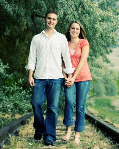
Technically
I processed the RAW file using Adobe Camera Raw 4.3.1. I left the white balance as shot, and I started with the “Auto” adjustment for the exposure settings. I tweaked a few minor things, then I got started in Photoshop CS3. Once in Photoshop, I applied a curves adjustment layer to increase contrast. Then I converted to black and white using the Channel Mixer adjustment layer at 34% red, 66% green, and 0% blue. I set the blending mode of this adjustment layer to “Overlay” and dropped the opacity to 80%. Then I desaturated the image using a Hue/Saturation adjustment layer by dropping the Saturation slider to -35. The final adjustment step was a Photo Filter adjustment layer using an LBA Warming Filter at a density of 35%. Then I cropped the image (see why in the next section). And finally, the rock in the foreground was a little off for me, so I cloned it out. No sharpening was applied.
Artistically
I felt the scene had a lot of potential and I knew I wanted the image to have a kind of timeless and carefree look and feel to it. The adjustment layers got the overall mood where I wanted it, but the composition was off for me. I loved the slight tilt in the image, but the upper half of the scene wasn’t working for me – the background was too dark on the left and too light on the right. It added too much tension and took away from the “carefree” feeling I wanted. So I played around with different crops and I finally landed on a 3:2 aspect that cut off just below the cuff of the white shirt on the left arm. To me, this was the most interesting part of the image (no offense to the models… or Rich for that matter). The photo was suddenly more timeless and relatable. It wasn’t about the two specific people in the photo — it was about the carefree feeling of walking down the old tracks on a sunny summer afternoon, hand-in-hand with the person you love.
Technically
My first step was to eliminate some of the empty space around the couple, so I cropped the image to bring the couple forward. I then tilted the image to take away the linear power that the original had, and also in hopes adding a more visual element to the picture. Overall, I felt the image had too much space around it, and was too much on the straight and upright!
Artistically
I bumped the contrast a little! I also played with different levels of contrast and decided that since the couple are wearing jeans containing pattern and texture , to bring out that element and use that as a unifier that this is a “couple”!
I then added a soften glow to the shot, and then layered a sepia toned layer on top. I took a black paint brush at around 2% opacity and painted over the whole image to achieve that black/sepia combo and add a little warmth and hopes of a romantic flair.
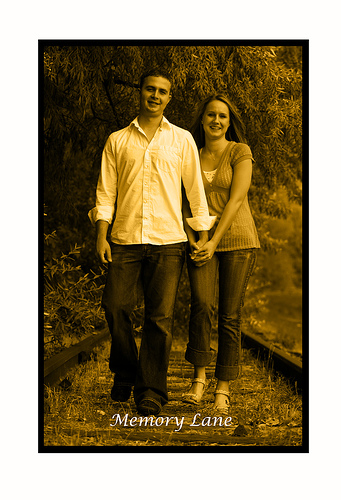
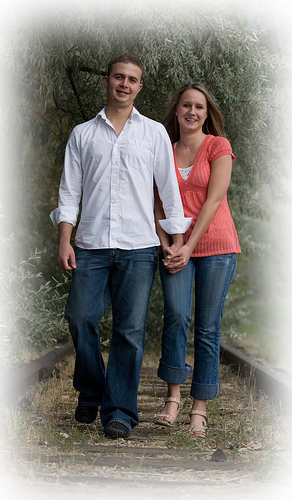
ARTISTICALLY
I looked at the photo and it seemed to be a pretty candid shot snapped mid action, but when I thought about it from the perspective of the couple, there was obviously going to be some memories associated with the event. It was obviously a staged candid shot. The railway tracks and the way they were dressed and walking holding hands suggested that a photographer had set this shot up for them – maybe as a anniversary special photo occasion or something. So while wild fantasies of photo shopping an old fashioned steam train in behind them to make them look as if they were in danger crossed my mind (in fact I even found some suitable photos) I didn’t attempt this. Instead I reasoned that the couple would be interested in framing this photo on their wall as a memory of this event or time in their lives. So I created two different looks and borders that would lend themselves to printing on canvas or photo paper and framing with a nice frame.
TECHNICALLY
Shot 1 – the sepia image. First I tightened the shot by cropping substantially. I then copied this onto a larger white canvas to create a large margin. I then changed the image to black and white using a gradient adjustment layer and then added a colour adjustment layer of sepia. I then created a slightly larger selection in the background and filled this with black to give the old time real photo look of the black edges and sepia tone. I then added the text at the bottom. This would look good in an old wooden frame – probably 2-3 inches in width in an old fashioned style.
Shot 2 – the soft edges. Once again I tightened the shot by cropping the extraneous material. I then create a border inside the edge and feathered this by 170 pixels. I then selected the inverse and deleted to create the soft edges. This would look good on a matt photo paper and framed in a thin metal frame, gold or maybe silver.
____________
And there you have it. I would again like to personally thank each participant for taking the time and energy to be involved in this little project. Based on the response, we will be doing this again in the future.