January 6th, 2009
Another stock image “In the Wild”
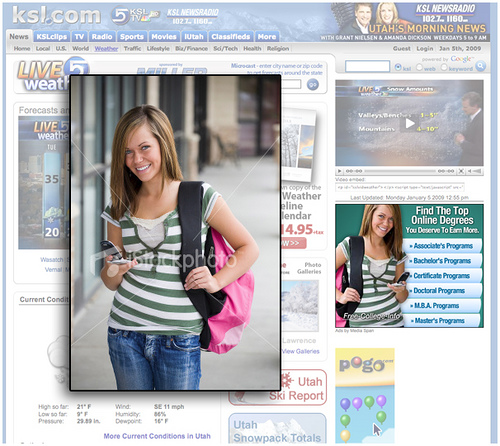
My neighbor Lee tipped me off yesterday afternoon to one of my stock images being used in an ad on KSL.com, the website of Utah’s NBC television affiliate. I’m sharing this today as another example of how designers will change or modify a stock image to fit their specific design needs.
In this instance, the design called for an ad with the text links on the right side. To make this work with my image, they did a horizontal flip of the shot. This change is virtually unnoticeable to everyone except me and Kylee (the model). I frequently see images flipped to fit design needs. Another example of this happened last year when USPS.com used my image of a graduate (link).
Additionally, for this ad the background was removed and the model isolated. This works very well in my opinion. I particularly like how they matched the ad’s color scheme with the green tone in Kylee’s shirt.
I’ve frequently said that I find roughly 1 in 1,000 of my sold images in “The Wild” (spotted in print, web or television). For me, the most interesting part of these finds is to see the context how the image is used. This is valuable information that I can put to use when shooting future stock imagery.
Labels: stock


