]]> 
I have since received the four edited images. In addition to doing a great job applying their editing chops to the image, they each wrote a narrative on what they did and why they did it. While the results are similar in many ways (no one cropped the shot?), they each added a little variation.
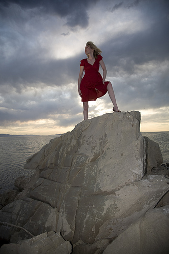
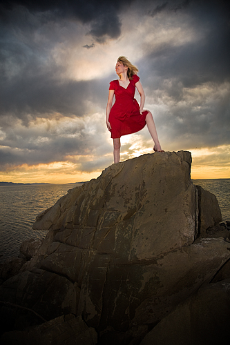
Each person was provided with an unedited JPG and RAW image (shown above) of the model standing on the rock at the Great Salt Lake. The only guideline given was that they could do whatever they wanted. Here are their results in no particular order.
Jake Spurlock

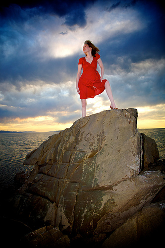
I was really excited when I saw that this was going to be the photo to work from, especially after I was unable attend the Photowalk at the Great Salt Lake a few weeks ago, and was further depressed when I saw the breathtaking images that came back to Flickr as a result. So, how cool is it then to get the chance to edit this image, and get to put a little bit of Jake Spurlock into it.
To Start:
I do all of my processing by starting with Apple Aperture. Beginning with the RAW 2.0 processing, I delved into the levels adjustments. I pulled black to black, crushing the blacks a little, created some highlights in white, and the made a nice midpoint. I did this on all three of the color channels respectively.
After levels, I moved into contrast, definitions, saturation, and vibrancy. When I take pictures, and then edit, reality isn’t at the top of my list of rules to follow. If I was going to make movies, 300, Batman Begins, and Speed Racer would be the inspiration. That being said, this photo evokes the idea of a warrior princess, standing guard over a kingdom. So, contrast is pushed, super saturation, and the image gains a lot of character.
One cool Aperture feature is the shadow recovery tool. Basically, it selectively adds some gain to the black areas of the photo. For video people, similar to setting the knee level for broadcasting equipment. Boosting this brought a lot of detail in from the rocks, and really shows off their awesome texture.
With these adjustments, I was really satisfied with the clouds, rocks and water. Yet, the warrior princess was a little dim, and lacking the glow that she deserved. So, I created a new version from the master, and went to work again creating the same look for her. When I was content with how she looked, I exported versions of both images, and brought them into photoshop for some blending.
This was a pretty simple, yet laborious process. I am sure that everyone reading this has had to do this before, so I won’t go into to much detail. I had my darker layer as the background, and then pasted the other on top. I went to work with the eraser/lasso/marquee tool getting rid of the excess. If you look at my image and contrast to the original, she is clearly a blond in the original, but I really like the look of her with dark hair and used the darker background source for that.
When all of the erasing was done, I used the dodge tool around her outline on the background layer to give her a little bit of an angelic glow. Followed up with spot healing brush for some legs, arm and face. I don’t bother too much, after all this is a warrior, not a cover model. 😉 After that, save as a .PSD, and reimport back into Aperture.
Once back in Aperture, I added another round of vignette. It created those dark and foreboding clouds, and added to the rock detail at the bottom. Part of the post process is to send revisions back and forth to my wife who has a great eye for detail. Wrote up a summary, and off to Rich for posting!
Thanks, what a fun process!
Visit Jake’s Flickr stream at flickr.com/photos/whyisjake/.
Jeremy Hall

How I Did It:
1. Adjust the RAW image using Adobe RAW for white balance and contrast. Most of this was done in the basic panel of sliders. Some additional HSL panel adjustments for color, especially the skies. Opened in Adobe Photoshop CS3.
2. Placed a second copy of the same image as a layer with RAW exposure adjustments for the model (ignoring the background). Masked this layer to block everything but the model. Rasterized this layer.
3. Made a copy of the second layer and changed to “Screen” mode for even more lightening of the model. Adjusted opacity of this layer to 27%.
4. Added a layer for cloning and healing tools. Used the “sample all layers” option to adjust the models dress to hide the seam in the middle. Felt like the leg showing and uneven shadows of the dress were distracting. I also removed some of the brighter splotches of white on the rock for the same reason.
5. Added a “Dodge & Burn” layer, which is a new layer filled with 50% gray. Using a larger brush set at 8% brushed in white and black alternately in varying places for contrast and emphasis. This was mainly used to darken the rock base and even out the exposure on the rest of it. I also increased the cloud dramatic contrast.
6. Added another masked dodge & burn to give a glow around the model for a kind of other-worldly glow, like the heavenly lights are pouring down on her. Cheesy I know, but it seemed to fit.
7. Added a photo filer layer to warm up the image a bit overall. Default warm (85%) color with a little added density.
8. For the web resized image, I downsized, added some Smart Sharpen filter on a copied layer (72%, 0.3 radius). Masked the layer and brushed on where I wanted the selective sharpening applied.
Visit Jeremy’s blog at www.whatsgottastay.com.
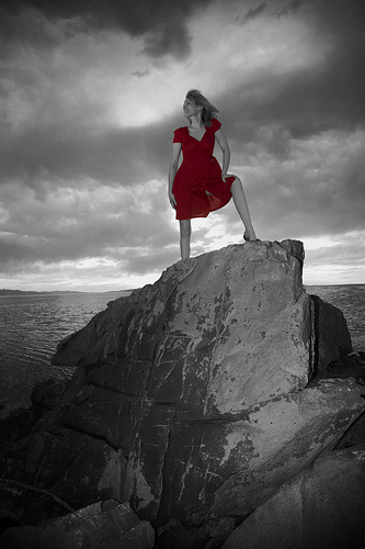
Patrick Fata

Thank you for the chance to work on this challenge. As a beginner, I appreciate the opportunity to concentrate on the post-processing only, while knowing that the result will be critiqued by a gifted and experienced photographer.
The picture has a very interesting composition and a lot of detail. This abundance of detail, especially in the rock, made me decide to go B&W. I also liked how the model’s dress stands out in the original, so I ended up going with selective desaturation.
To obtain the B&W, I output the red channel to gray using a channel mixer layer. I also added a Curves layer to darken the shadows a bit. Still wanting more contrast in the rock, I isolated it, copied it onto a new layer, and applied an overlay blend mode.
The red dress was isolated using a color range select, and then tweaking that selection with mostly the eraser. I then brightened the red a little by turning the cyan down in the red channel of a selective color adjustment layer.
I hope to have done justice to your great photo.
Visit Patrick’s blog at www.lestrodesigns.com/blog.
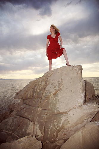
Seva Seetharaman

The original image itself had a very nice contrast to it so I decided not to tamper with it too much. To me, this was one of those images that needed very little modifications to make it look the way it should. So below are some changes that I thought would make the image look better.
1. I started off by adjusting the color curves in GIMP to enhance the overall temperature of the image.
Thanks for giving me this opportunity and would like to participate in another one if possible.
Visit Seva’s blog at picsnbytes.blogspot.com/.
___________________
And there you have it, the four edited images. If anyone else would like to take a shot at this image, grab the original from leggnet.com/images/blog/photoshop and post a link to your edited version in the comments.
Labels: photoshop


