February 29th, 2008
Rule of Thirds – Revisited
Today’s simple scenery image of a lone pine tree against a blue sky is a perfect chance to revisit a previous post from last year concerning the Rule of Thirds. Have a great weekend!
Canon 5D, Canon 24-105 f/4L lens – 1/200 second, f/8, ISO 100
from April 1, 2007:
One of the first things to get emphasized to novice photographers by those who claim to be more knowledgeable is to “Follow the rule of thirds”. While this is sound advice, the phrase can be confusing. Let’s take a few moments and simplify this “Rule” so that we all can use it when making captures regardless of our experience.
Simply put, the Rule of Thirds is a tool to use when composing a photograph. The way I like to instruct it is this: Place four evenly spaced imaginary lines on your image, 2 horizontal and 2 vertical. I have even further simplified it to some (mainly children) by suggesting that they imagine a “tic-tac-toe” board over the photo. Once you can picture the lines, place your subject very near a line and, if possible, arrange the main focal point of the subject where two of the lines intersect. In doing so, you increase the odds that you will create a photo that is visually appealing to how the human mind interprets the image.
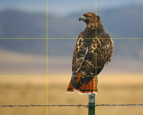
For today’s image (above) I took one of my favorite hawk photos and added yellow lines to help illustrate the process. When composing the photo I placed the bird on the right most vertical line. The main focal point of the bird is the eyes and beak, but I found that if I placed them on an intersection the photo was a bit bottom heavy. Instead, I placed the bird’s body where the two nearest lines meet. Doing so creates a pleasing composition since the birds head is close enough to an intersection to take advantage of the rule. Had I taken the same photo and composed it differently by placing the bird in the center of the image, the result would not be as pleasing.
Since I’m on the subject of image composition, the image above demonstrates another “Rule” that can be followed to make a shot more pleasing. In most situations it is desired to have the subject looking toward the center of the image. If the bird were looking to the right rather than the left, the photo would not be as pleasing to the viewer’s eye. In fact, to many people it would just “feel uncomfortable”. The same can be said for motion. If the photo is of a subject in motion, compose it so it is moving toward the image’s center.
Lastly, remember the old phrase “Rules are made to be broken”. There are plenty of times when a more pleasing image can be created by breaking the Rule of Thirds rather than following it. Try using this rule as a guideline and see if your work improves.
LeggNet’s Digital Capture
© Rich Legg, Inc. All rights reserved.


